
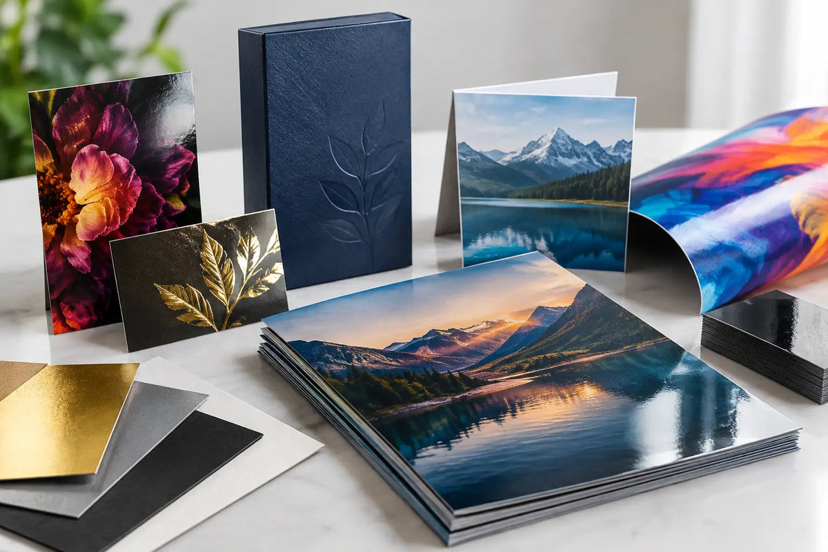
A business card that feels substantial, a menu that wipes clean, and a product box with a crisp foil detail all make an impression before anyone reads the message. This guide to commercial print finishes helps procurement teams, marketers, retailers, and event organizers select the right final treatment for printed materials that need to look professional, work hard, and represent the brand consistently.
The finish is not a decorative afterthought. It affects how colors appear, how the piece feels in hand, how well it handles frequent use, and how efficiently it moves through production. The right choice depends on the item, its environment, the artwork, and the result you want people to notice.
What Commercial Print Finishes Do
A print finish is a coating, film, texture, or added detail applied after printing or during finishing. Some finishes primarily protect the surface. Others create contrast, improve tactility, or draw attention to a specific brand element.
For a restaurant, that may mean a protective finish for menus and table cards exposed to regular handling. For a corporate presentation folder, it may mean a refined matte surface that supports a premium, understated look. For product packaging or event invitations, a foil accent or raised detail can give a logo stronger shelf or table presence.
The practical question is not which finish is best overall. It is which finish supports the purpose of the printed piece without making production, usability, or budget unnecessarily complex.
Guide to Commercial Print Finishes by Use Case
Gloss and matte coatings
Gloss coatings reflect light and make photographs, bright colors, and high-contrast artwork appear more vivid. They are commonly used for flyers, product inserts, promotional cards, catalogs, and packaging where visual energy matters. A gloss surface can also provide a degree of scuff and moisture resistance, depending on the coating and stock.
The trade-off is glare. Fine text can be harder to read under direct lighting, and fingerprints may be more visible on dark, solid-color areas. Gloss is usually a strong choice for image-led campaigns, but it may not suit formal stationery or documents designed for easy writing.
Matte coatings offer a low-reflective, smooth appearance. They work well for company profiles, folders, premium brochures, menus, and branded packaging where readability and a restrained visual style are priorities. Matte surfaces make dense text and subtle color palettes easier to view under office or venue lighting.
Matte does not automatically mean more durable. Some matte surfaces can show marks or rubbing, especially on dark colors. Ask for the most suitable stock and protective option when the item will be carried, stacked, or handled repeatedly.
Lamination for protection and durability
Lamination applies a thin plastic film to the printed sheet. It is often selected for business cards, menus, booklets, folders, tags, product cards, and printed pieces that need more resistance to handling.
Gloss lamination delivers a polished, reflective look with good visual impact. Matte lamination creates a more refined finish while adding surface protection. Both are reliable options when a piece needs to remain presentable through distribution, meetings, retail display, or repeated use.
Lamination does add thickness and changes how the paper folds and feels. Designs with folds, scores, or large solid ink areas should be reviewed before production. For foldable materials, correct scoring is essential to reduce cracking along the crease.
Soft-touch lamination
Soft-touch lamination has a velvet-like feel and a sophisticated matte appearance. It is often used for premium packaging, presentation folders, high-end business cards, invitation cards, and selected marketing collateral.
It is particularly effective when a brand wants people to pause and interact with the piece. A soft-touch surface paired with spot UV on a logo can create a clear contrast between a muted background and a glossy focal point.
This finish is not ideal for every high-volume item. It can cost more than standard lamination, and dark designs may require careful handling to avoid visible marks. Use it where tactile value supports the campaign, product position, or client-facing experience.
Spot UV for focused contrast
Spot UV is a high-gloss varnish applied only to chosen parts of the design, such as a logo, pattern, product image, or headline. It is most noticeable over a matte or soft-touch laminated background, where the contrast is immediate.
For corporate stationery, spot UV can highlight a logo without covering the entire card in shine. For packaging, it can emphasize a product name or a graphic feature that needs attention at first glance. The effect works best with clear, simple shapes rather than very fine lines or tiny type.
Spot UV should be planned in the artwork as a separate finishing layer. Placement accuracy, minimum line thickness, and the space around folds or edges matter. A production-ready file helps prevent an attractive concept from becoming an impractical finish.
Foil stamping for premium brand details
Foil stamping uses heat and pressure to apply metallic or colored foil to selected areas. Gold and silver are common choices, but foil is also available in colors and specialty effects depending on the project.
Foil is effective for logos, names, borders, seals, and short messages on premium business cards, gift boxes, certificates, folders, and event materials. It reflects light differently from printed metallic ink, giving the detail a more distinct visual presence.
Use foil selectively. Large foil areas can dominate the design, and intricate artwork may need adjustment for clean application. The best results usually come from a focused accent that supports the brand identity rather than competing with every other element on the page.
Embossing and debossing
Embossing raises a design above the paper surface. Debossing presses it into the sheet. Both create a physical impression that people can see and feel, making them well suited to executive stationery, premium packaging, certificates, and formal invitations.
These finishes depend heavily on paper choice. Thicker, stronger stocks generally produce a more convincing result than thin paper. Embossing may also affect the reverse side of the sheet, so double-sided layouts need careful planning.
A blind emboss or blind deboss uses no ink or foil, relying only on light and shadow. This can be an elegant option for a subtle logo treatment. Combining embossing with foil creates a more noticeable effect, but it requires precise setup and should be reserved for designs where the added impact justifies the process.
Match the Finish to the Material and Environment
The printed substrate matters as much as the finish. Coated paper, uncoated paper, textured stock, board, synthetic materials, and adhesive labels each accept finishes differently. An effect that looks sharp on a rigid packaging board may not be suitable for a lightweight flyer or a label applied to a curved container.
Consider how the item will be used. A retail hang tag, a takeaway menu, and an exhibition brochure have different durability needs. Materials used outdoors or in demanding conditions require the right substrate, ink system, and protective treatment from the start. A decorative finish alone does not make a standard paper item suitable for prolonged outdoor exposure.
For UAE businesses, this is especially relevant for materials used at events, in retail environments, or during frequent delivery and handling. Discuss where the item will be displayed, stored, and used before confirming the specification.
Prepare Artwork for Finishing
Commercial finishes add production requirements that should be addressed before printing begins. Keep critical text and logos away from trim edges, folds, holes, and die-cut areas. If a finish is applied only to part of the design, provide that element as a separate, clearly labeled layer in the artwork.
Use vector artwork for foil, embossing, debossing, and spot UV wherever possible. Avoid overly fine details, narrow gaps, and small reversed text unless the production team confirms they are suitable. Color expectations also need to be realistic: a metallic foil, gloss varnish, and printed metallic ink are different effects and should not be treated as interchangeable.
A physical sample or proof is valuable for premium projects, particularly when color, texture, folding, and specialty details all matter. It gives the team a chance to assess the finish in real lighting and make adjustments before committing to a full production run.
Choose a Finish That Supports the Job
A polished finish should make business materials easier to use and harder to ignore. Start with the function: protect a menu, improve a package, create a stronger event handout, or add distinction to a client-facing card. Then select the finish that delivers that result with the right balance of appearance, durability, and production practicality.
When your artwork, material, and finish are planned together, the final piece feels intentional. Share the intended use, quantity, size, and deadline with Printava when requesting a quote, and the team can help specify a finish that fits the job from the first proof to final delivery.