
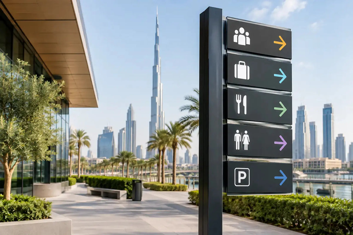
A visitor who has to ask for directions twice has already noticed a gap in your customer experience. In a busy office tower, retail destination, clinic, hotel, warehouse, or event venue, signage determines whether people move confidently or lose time at every turn. This Dubai wayfinding signage guide explains how businesses can plan directional signage that is clear, on-brand, durable, and practical to install.
Wayfinding is not simply a collection of arrows. It is a system that helps people understand where they are, where they need to go, and what they should do next. When that system is designed well, it reduces pressure on front-desk teams, supports accessibility, improves safety, and gives your space a more organized professional appearance.
Start With the Visitor Journey
Before choosing materials, sizes, or finishes, map the route a first-time visitor will take. Start from the parking area, entrance, reception desk, elevator lobby, or event registration point. Then trace the journey to key destinations such as departments, meeting rooms, restrooms, checkout counters, consultation rooms, exits, and service areas.
Look for decision points. These are the places where someone must choose between two corridors, floors, doors, or service counters. A sign placed after the decision point is too late. Directional signage should appear before the visitor needs it, with enough time to read and act on the information.
For a corporate office, the priority may be reception, meeting rooms, departments, and emergency exits. For a retail store, customers may need clear directions to fitting rooms, payment counters, collections, returns, and promotions. At an exhibition, the critical route often runs from entrance to registration, booths, session areas, food service, and exits. The correct sign package depends on how people actually use the space.
Identify the Sign Types You Need
Most wayfinding programs use a combination of directional, identification, regulatory, and informational signs. Directional signs tell people where to go. Identification signs confirm that they have arrived, such as room numbers, department names, or restroom markers. Regulatory signs cover rules, restricted access, health and safety instructions, and emergency guidance. Informational signs may display operating hours, visitor procedures, maps, or service details.
The goal is not to add signage everywhere. Too many competing messages can make a site harder to navigate. Use the fewest signs needed to keep each journey clear, then make every sign easy to scan.
Dubai Wayfinding Signage Guide: Design for Fast Reading
People do not read wayfinding signs the way they read a brochure. They glance, identify a destination, follow an arrow, and keep moving. That means the content must be brief and the visual hierarchy must be immediate.
Use familiar destination names consistently. If a directory calls an area “Customer Service,” do not label the door “Client Support” unless both terms are clearly connected. Inconsistent naming creates hesitation, especially in large offices or multi-tenant locations.
Font selection should favor legibility over decoration. Clean sans-serif typefaces are often effective for directional signs because they remain readable at a distance. Use sufficient contrast between text and background. Dark text on a light background or light text on a dark background can both work well, provided the contrast stays strong under the actual lighting conditions.
Arrows deserve more attention than they usually receive. Keep arrow styles consistent throughout the property and position them close to the destination name. A left-facing arrow placed on the far right of a sign can slow reading because the eye has to move back and forth. Small layout choices affect how quickly visitors understand the message.
For spaces serving international visitors, bilingual layouts may be necessary. Arabic and English text should be planned as part of the original design, not added as an afterthought. This affects panel size, typography, spacing, and the order in which information is read. A professional signage supplier can prepare artwork that maintains brand consistency while allowing both languages to remain clear.
Choose Sizes Based on Viewing Distance
A sign that looks excellent on a screen can fail once installed. Viewing distance, mounting height, corridor width, and ambient light all affect the required size. A small door plaque can work at close range, but an overhead directional sign in a lobby must be readable from much farther away.
Consider how people approach the sign. Visitors walking quickly through an airport-style corridor need larger text and simpler messages than guests standing in front of a reception directory. Signs viewed from a vehicle need a different scale than signs viewed on foot.
As a practical rule, confirm the final location before production. A site survey helps identify sightline obstructions such as pillars, glass partitions, open doors, plants, display fixtures, and ceiling features. It also prevents the costly mistake of ordering signs that do not suit the available mounting area.
Select Materials for the Environment
The right material depends on location, expected use, cleaning requirements, and brand presentation. Interior office signage often uses acrylic, aluminum composite panels, PVC foam board, vinyl graphics, or layered lettering. Each option creates a different visual effect and has different advantages for installation and maintenance.
Acrylic signs can provide a polished finish for reception areas, executive offices, directories, and meeting rooms. Aluminum composite panels offer a firm, professional surface and can suit both interior and exterior applications when specified correctly. Vinyl graphics are useful for glass doors, walls, windows, and temporary campaigns because they can carry detailed branding without adding bulky panels.
For outdoor locations, material selection must account for heat, sunlight, dust, moisture, and cleaning. UV-resistant printed graphics and suitable protective finishes help maintain color and readability over time. Outdoor wayfinding also requires secure fixing methods. A visually strong sign is of little value if it is not properly mounted for its environment.
Temporary signs have their place as well. Events, launches, pop-up retail, and short-term construction access may call for portable stands, roll-up displays, foam board signs, floor graphics, or removable wall vinyl. The trade-off is durability versus flexibility. Permanent signage should be built for long-term use, while temporary systems should prioritize transport, setup speed, and easy replacement.
Build Brand Consistency Into Every Direction
Wayfinding signage should help people move through a space without making them feel like they have entered a different brand environment. Use your approved logo treatment, brand colors, typography, and tone of voice, but do not let visual branding overpower clarity.
A useful approach is to assign a hierarchy. Your brand elements can frame the system, while destination names and arrows remain the most prominent information. For example, a company color may appear as a header band or accent line, while the directional text uses a high-contrast neutral background for readability.
Consistency also applies to finishes and fabrication. If reception signage uses brushed metallic elements, meeting-room plaques, floor directories, and directional panels can carry a related visual language. They do not need to be identical, but they should feel deliberately connected.
Plan Installation, Updates, and Maintenance
Signage is easier to manage when future changes are considered during the first order. Departments move, tenants change, meeting rooms are renamed, and retail layouts evolve. Fixed signs may be appropriate for permanent destinations, but interchangeable inserts, modular directories, or replaceable vinyl panels can reduce disruption when information changes.
Installation planning should cover mounting surface, access requirements, fixing method, electrical needs for illuminated signs, and the best time to work on site. Offices and retail spaces may need installation outside trading hours or during quieter periods. Clear measurements and approved artwork before production help keep the project on schedule.
After installation, walk the route as a visitor would. Check whether signs are visible from approach angles, whether arrows point correctly, and whether the language is consistent across the site. This final check often catches small issues that are difficult to notice when reviewing individual artwork files.
A Practical Signage Brief Speeds Up Quoting
When requesting a quote, provide as much operational detail as possible. Include the number of locations, site photos, approximate dimensions, mounting surfaces, indoor or outdoor use, required languages, brand guidelines, and installation requirements. If you have a floor plan, mark destinations and decision points directly on it.
You should also clarify whether the signs are permanent, temporary, or part of a phased rollout. A phased approach can be useful for businesses opening a new site, refreshing office branding, or preparing for a major event. It allows priority areas to be completed first while keeping materials and design standards consistent across later stages.
Printava supports businesses with custom directional signs, branded panels, window graphics, wall graphics, exhibition signage, and display materials designed around the real requirements of each location. The best result comes from matching the right material, size, print finish, and installation method to the visitor journey.
Clear wayfinding gives every customer, guest, and employee a better first impression before a conversation even begins. Start with your floor plan, identify the moments where people hesitate, and get a signage quote that turns those gaps into clear next steps.