Your logo looked perfect on a screen, then it hit a business card or a 10-foot backdrop and suddenly the edges looked soft, the colors shifted, or the text got fuzzy. That usually isn’t a printer problem. It’s a file format problem - specifically, using the wrong kind of file for the job.
If you’re asking “what file format for printing logo,” the practical answer is: start with vector whenever possible, then choose the format that matches the product, print method, and workflow. The goal is simple - predictable brand consistency across everything from letterheads to exhibition walls, without slowing down approvals or production.
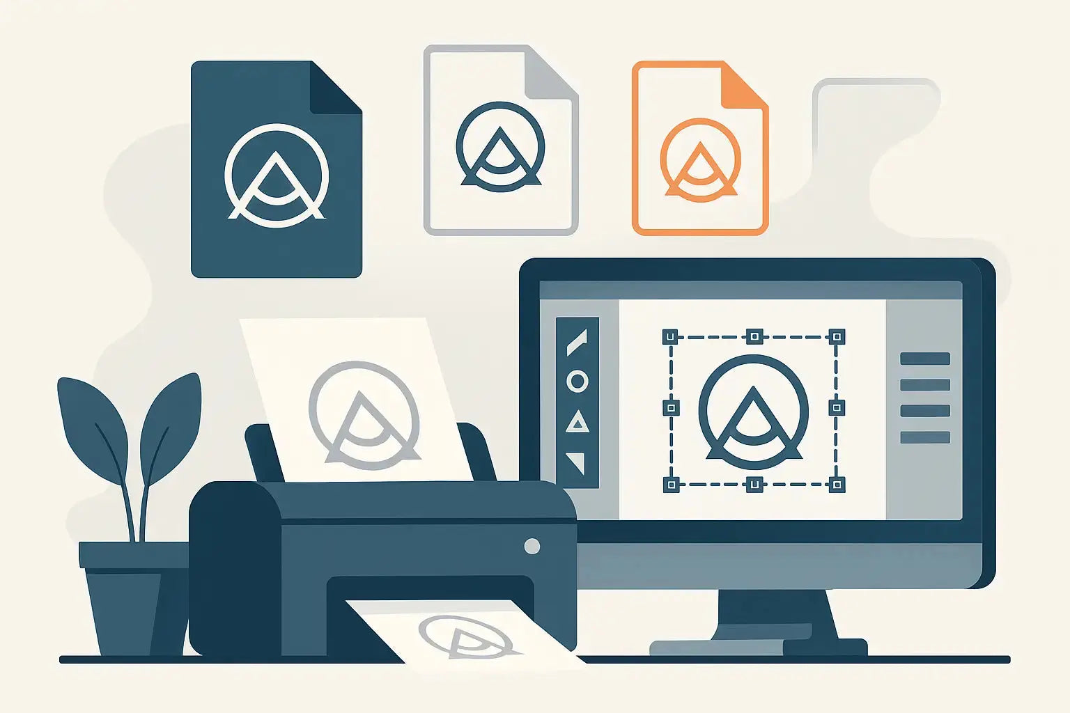
What “print-ready” actually means for a logo
A print-ready logo file is one that can be scaled to any size without quality loss, uses the right color system for the print process, and doesn’t rely on missing fonts or linked images. It should open cleanly for prepress checks and production.That means two things matter more than the file extension itself: whether it’s vector or raster, and whether it’s built with production in mind.
Vector vs. raster: the decision that drives everything
Vector logos are built from shapes and paths. They scale infinitely, which is why they’re the standard for professional printing. Raster logos are made of pixels. They can look fine at one size, then fall apart when enlarged.If you’re printing across multiple items - signage, uniforms, packaging, corporate gifts - a vector master file saves time and prevents quality surprises.
The best answer to “what file format for printing logo”
For most business printing, the safest default is a vector PDF or the original vector source file (AI or EPS). These formats preserve sharp edges, keep typography clean, and handle scaling without requiring you to guess the “right” resolution.Where teams get into trouble is sending a PNG or JPG because it “looks clear” on a laptop. A screen preview doesn’t reveal whether the file will hold up under close inspection on premium paper, embroidery, or large-format print.
AI: best for master files and professional workflows
Adobe Illustrator (AI) files are ideal when you want maximum editability and control. They keep all vector paths, layers, and color definitions intact, which is helpful when a logo needs small production adjustments - for example, separating elements for screen printing, changing a stroke weight for small text, or preparing spot colors.AI is a strong choice if your brand team maintains an official logo package. It’s also the best file to store internally as your “source of truth.” The only downside is that not every buyer or stakeholder can open it without design software, so it’s not always the easiest file to share for approvals.
PDF: best all-around for sending to print
A print-ready PDF is often the fastest route from upload to production. It’s widely supported, easy to review, and can contain vector artwork, embedded fonts, and color profiles.For procurement teams and marketers moving fast, PDF is the most practical “send to vendor” format because it reduces missing-font issues and keeps the artwork stable across different systems. If you have a choice, export a vector PDF (not a rasterized one), and keep text as text unless your workflow requires outlining fonts.
PDF is also a smart option when you’re printing multiple items at once and want one consistent file format for the whole order.
EPS: reliable for legacy systems and certain production lines
EPS is an older vector format, but it’s still widely used in printing and promotional merchandise workflows. Many production environments that handle signage, giveaways, and specialty printing have EPS-friendly pipelines.EPS is great for a logo mark, wordmark, or simple lockup. It’s less ideal for complex transparency or modern effects, since some EPS exports can flatten artwork in ways that aren’t obvious until production. If your logo uses gradients, drop shadows, or transparency, a PDF (or AI) is often safer.
SVG: great for web, sometimes helpful for print
SVG is a vector format built for digital use. It’s excellent for websites and UI applications, and it can be a convenient way to store clean vector artwork.For printing, SVG can work if your print partner accepts it and your logo is straightforward. The reality is that many print workflows still prefer PDF, AI, or EPS. If you only have an SVG, you can usually convert it into a print-ready PDF or AI without losing quality - as long as the SVG was exported correctly and the logo was created as true vector.
PSD: useful only when your logo is actually vector inside
Photoshop (PSD) files are common in marketing teams, but PSD is not automatically print-ready. If your “logo” is a flattened bitmap inside a PSD, it will behave like any other raster file - it will pixelate when enlarged.A PSD can be acceptable if the logo is built as vector shapes within the file or if you’re printing at a fixed size with enough resolution. Still, for repeat use across many products, a vector file is the better operational choice.
PNG: acceptable for some jobs, not a universal printing file
PNG is popular because it supports transparency. For certain quick-turn applications - internal mockups, simple stickers at small sizes, or when a product is printed at the exact dimensions of the file - PNG can work.But PNG is raster. If your logo is ever going on a large surface (a backdrop, wall graphic, roll-up banner) or needs to look premium up close (stationery, presentation folders), PNG becomes risky unless it’s extremely high resolution and correctly sized.
PNG is a “use with care” format. It’s not the file you want to rely on for brand rollouts.
JPG: last choice for logos
JPG doesn’t support transparency and uses compression that can create artifacts around edges - exactly where logos need to stay crisp. A high-quality JPG can be usable for large photographic prints, but for logos it’s usually a compromise.If a supplier says they can print from a JPG, what they really mean is they can attempt it. If your goal is consistent corporate quality, send vector instead.
How to choose the right file format by what you’re printing
The “best format” changes based on the item and the printing method. Here’s the operational way to decide.For business cards, letterheads, and brochures
Go with vector PDF (preferred) or AI/EPS. These products are small, high-contrast, and inspected closely. Tiny type and fine lines need vector precision.For large-format printing like backdrops, banners, and signage
Vector PDF or AI is best. Large format magnifies problems fast. If you must use raster, you need the file built at full size with enough resolution, and you should expect larger file sizes.For promotional items and corporate gifts
This depends on the decoration method. Screen printing, pad printing, laser engraving, and embroidery all benefit from clean vector artwork. PDF, AI, or EPS keeps separations and edges clean.For apparel and embroidery
Vector is still the starting point, but embroidery digitizing may simplify shapes and adjust thicknesses. Sending a vector file helps the digitizer work accurately. A PNG rarely contains the information needed for clean stitch paths.Color matters as much as format
Many logo problems show up as “wrong color,” but the file format is only part of it. The bigger issue is whether the file is defined in RGB or CMYK, and whether you’re using spot colors.RGB is for screens. CMYK is the standard for most print processes. Spot colors (like Pantone) are used when brand accuracy is critical and the print method supports it.
A professional print-ready PDF or AI file can be set up correctly for CMYK or spot colors. A PNG or JPG often comes from RGB workflows, which increases the chance of unexpected shifts - especially in bright blues, greens, and oranges.
Resolution rules when you can’t avoid raster
Sometimes you only have a raster logo, or the logo includes photographic elements. If you’re forced to use raster, resolution becomes the safety net.For most print items viewed up close, 300 DPI at final print size is the standard target. For large-format pieces viewed from a distance, you can sometimes go lower, but you should decide that intentionally, not by accident.
The key point: DPI only matters relative to final size. A “300 DPI” file that’s only 1000 pixels wide will still look bad on a wide banner.
Quick checks before you upload any logo file
Before you send artwork to production, open the file and test three things: can you zoom in to 800% without seeing pixelation, are the colors defined for printing (CMYK or spot where needed), and are fonts embedded or outlined so nothing changes when the file is opened elsewhere.If you’re working against a deadline - event setup, campaign launch, or a procurement cutoff - these checks prevent last-minute rework.
If you want a single vendor that can take your upload, flag issues early, and turn around corporate print and branded merchandise quickly, Printava Advertising Requisites Trading L.L.C is built for that execution-first workflow.
The most common file-format mistakes that cost time
The slowdowns are predictable: sending a low-resolution PNG because it has a transparent background, exporting a PDF that accidentally rasterizes the logo, using RGB colors for a print run that needs brand accuracy, or supplying a JPG pulled from a website header.These mistakes don’t just affect quality. They affect approvals, reprints, and event readiness. When multiple departments need the same logo for multiple items, one clean vector master file eliminates repeated back-and-forth.
A helpful rule to keep your team aligned: store a vector master (AI or EPS), share a print-ready PDF for production, and keep PNGs only for digital uses and quick previews. Your future self - and your event timeline - will thank you.