A file can look perfect on screen and still create problems at press time. That usually happens when bleed is missing, colors are built in RGB, fonts are not embedded, or the exported PDF uses the wrong settings. If you are learning how to prepare print ready PDF files for business printing, the goal is simple: deliver artwork that prints cleanly, accurately, and without avoidable back-and-forth.
For marketing teams, procurement managers, and event coordinators, this matters because file setup affects both speed and final quality. A properly prepared PDF helps protect deadlines, keeps branding consistent, and reduces the risk of output issues on brochures, packaging, stickers, signage, presentation folders, labels, and exhibition materials.
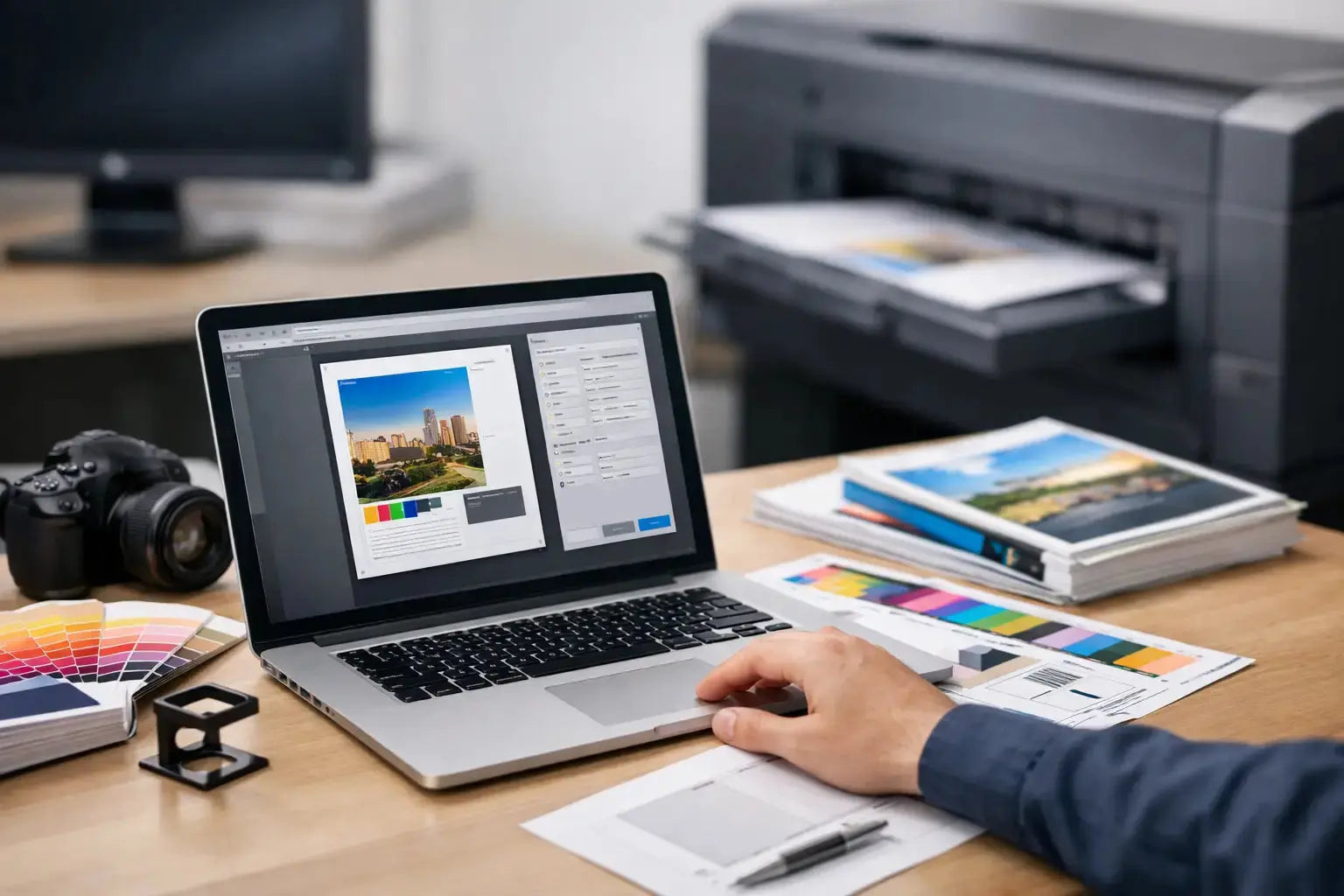
What makes a PDF print ready
A print-ready PDF is a file prepared for commercial production, not just for viewing. It includes the correct page size, proper bleed, high-resolution images, print-safe color settings, and embedded fonts. It is also exported with settings that preserve artwork quality instead of compressing it for email or web use.
This is where many jobs go off track. A standard PDF generated from office software may be fine for sharing a proof internally, but it is often not suitable for final print production. Commercial printing requires more precision because trimming, color reproduction, and finishing all depend on how the file is built.
How to prepare print ready PDF files without production delays
The best approach is to work backward from the finished product. Before exporting anything, confirm the final size, stock, folds, finishing, and whether the artwork is single-sided or double-sided. A business card, carton sleeve, window sticker, and roll-up banner all need different setup decisions.
If your supplier has a template, use it. Templates remove guesswork around dimensions, safe zones, die lines, and panel widths. This is especially useful for packaging, labels, exhibition graphics, and custom display items where structure matters as much as artwork.
Set the correct document size
Start with the final trim size, not a rough estimate. If the brochure will be 8.5 x 11 inches finished, the document should be built to that exact trim size before bleed is added. If a folder or box has a custom dieline, use the approved layout exactly as supplied.
Wrong document dimensions cause scaling problems later. Even a small mismatch can shift text, distort logos, or affect alignment across folded panels.
Add bleed and respect safe margins
Bleed is the extra image area that extends beyond the trim edge. This allows background colors, photos, and design elements to run cleanly to the edge after trimming. In most commercial print jobs, 0.125 inches of bleed on all sides is standard, though some large-format or packaging work may require different settings.
Safe margins matter just as much. Keep logos, text, QR codes, and critical graphic elements inside the safe area so they do not sit too close to the cut line. Trim tolerances are normal in production. If important content is placed too near the edge, the finished piece can look cramped or uneven.
Use CMYK, not RGB
One of the most common issues in learning how to prepare print ready PDF files is color mode. Screens display RGB, while most commercial printing uses CMYK. If artwork stays in RGB until the final stage, color shifts are more likely, especially with bright blues, greens, and neon-like tones.
Convert files to CMYK during design, not after everything is finished. This gives you a more realistic view of how colors will reproduce in print. If your brand uses specific corporate colors, spot colors may be appropriate for some jobs, but that depends on the product, quantity, and print method.
For brand-sensitive work such as packaging, stickers, premium corporate materials, or event graphics, it is worth confirming color expectations early. Not every item prints on the same substrate or machine, so exact color matching may vary slightly depending on the application.
Check image resolution
Images should generally be 300 DPI at final print size for standard print applications. If you enlarge a low-resolution image inside the layout, the file may still export as a PDF, but the printed result can appear soft or pixelated.
This is especially important for catalogs, brochures, product cards, menu printing, and promotional inserts where photography carries the message. For large-format items viewed from farther away, resolution needs can differ, but artwork still has to be suitable for the final display size.
Embed fonts or outline them when appropriate
Missing fonts can alter line breaks, spacing, and overall layout. A print-ready PDF should have fonts embedded so the file displays and prints correctly on another system.
Some designers choose to convert text to outlines for added control, particularly in logos or final artwork files. That can work, but it also removes editability. If the piece may need future updates, embedded fonts are often the more practical option. The right choice depends on whether the file is a final locked asset or part of an ongoing campaign.
Review transparency, layers, and overprint settings
Complex artwork can contain effects that look fine in design software but reproduce differently when exported. Transparency, drop shadows, layered objects, and overprint settings should be checked carefully.
This is particularly relevant for label artwork, packaging, and files with white ink, metallic elements, or special finishes. If your artwork includes technical layers such as cut contours, varnish masks, or foil areas, those should be clearly named and separated according to production requirements.
Export settings for print-ready PDF files
Once the artwork is approved, export using a print-quality PDF preset rather than a smallest-file-size or screen-viewing option. Compression should preserve image quality, bleed should be included, and crop marks should only be added if your printer requests them.
PDF/X standards are often preferred because they are designed for print workflows. PDF/X-1a is commonly used for flattened, CMYK-based output, while PDF/X-4 supports live transparency and can be useful in modern production environments. Which one is best depends on the printer's workflow, so if you are unsure, ask before exporting final files.
It also helps to name files clearly. A filename like "Event-Backdrop-120x230cm-Final-Print.pdf" is more useful than "final-v7-new.pdf." Good file naming speeds up proofing, approval, and production.
Common mistakes to avoid
Most print file issues come from a short list of preventable setup errors. Artwork exported without bleed, logos supplied from web screenshots, rich black used incorrectly on body text, and low-resolution linked images are all common examples.
Another frequent issue is approving artwork based on a digital proof without checking the actual trim, folds, or panel order. On tri-fold brochures, presentation folders, and packaging sleeves, panel sequencing matters. On stickers and labels, shape and cut path accuracy matter. On signage, final scale and viewing distance matter.
That is why file review should be treated as part of production, not just a design task. A few extra minutes before submission can save much more time later.
A practical preflight check before you send files
Before uploading artwork, review the PDF at 200 percent or more. Confirm final size, bleed, image sharpness, color mode, and spelling. Scroll each page and check that no text sits too close to the edge. If the piece folds, mock the reading order logically. If it is double-sided, check front-to-back orientation.
Then open the PDF in a standard viewer, not only in the design program used to create it. This helps catch export issues that may not show in the original layout file. If your team handles multiple branded assets across campaigns, a simple internal checklist can keep approvals faster and more consistent.
For businesses ordering packaging, corporate stationery, labels, promotional prints, or event materials, working with an experienced production partner also reduces file friction. Printava supports artwork review across a wide range of business printing applications, which helps clients move from design to production with fewer revisions and better predictability.
When it makes sense to ask for file guidance
Not every print job needs the same setup. A standard flyer is straightforward. A custom box, acrylic sign, fabric backdrop, or die-cut sticker set is not. The more technical the product, the more useful it is to confirm specs before final artwork is built.
If the job includes custom finishing, unusual materials, large-format graphics, or brand-critical color requirements, ask for the template, size confirmation, and export guidance first. That small step keeps production cleaner and helps your team order with confidence.
Good printing starts long before the press runs. When your PDF is built correctly, approvals move faster, production stays on track, and the final piece does its job the moment it is delivered. Get the setup right, and the print result usually follows.