A banner can look sharp on your screen and still fail at full size. That usually happens when the file setup was treated like a standard flyer or social post. If you are figuring out how to prepare artwork for large banners, the goal is simple: build a print-ready file that stays clear, readable, and on-brand when it is produced at scale.
For business banners, small setup mistakes become very visible. A logo that looked centered can feel cramped once hems and grommets are added. A background image that seemed acceptable on a monitor can print soft when enlarged. And copy that reads well at arm's length may disappear across a showroom, retail frontage, or event hall. Good artwork preparation protects your investment before production begins.
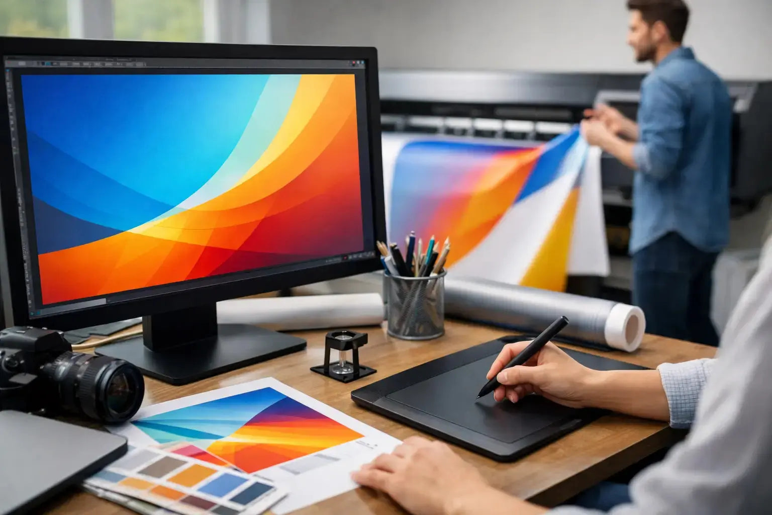
How to prepare artwork for large banners without print issues
The first decision is the final banner size. This sounds obvious, but many artwork problems begin when the design is created before the actual dimensions, finishing method, and display location are confirmed. A banner for a trade show backdrop has different viewing distance requirements than a street-facing outdoor banner or an in-store promotional panel. Start with the exact finished size in inches or millimeters, then confirm whether there will be hems, pole pockets, eyelets, or reinforced edges.
Once the size is locked, build the artwork to scale. In many cases, large-format files are created at a reduced scale such as 1:2 or 1:10 to keep the file manageable. That works well, but only if every element is scaled consistently and the production team knows the ratio. If the banner is straightforward and the file remains stable, designing at full size is often the clearest option. For very large signage, scaled artwork is common and practical.
Resolution is the next area where expectations need to be realistic. Large banners are not prepared the same way as brochures. A brochure handled close to the eye often needs 300 DPI at final size. A banner viewed from several feet away usually does not. Depending on the size and viewing distance, 100 to 150 DPI at final size is often sufficient for strong print quality. For very large banners viewed from farther away, even lower effective resolution may still work well. The key is not chasing unnecessary file weight. The right resolution depends on where and how the banner will be seen.
Set size, bleed, and safe area correctly
Bleed matters on banners, especially when background colors or images run to the edge. A standard bleed allowance helps prevent thin white edges after trimming. The exact amount can vary by product and finishing method, so it should be confirmed before export. As a working rule, add enough bleed on all sides and keep critical text, logos, and key graphics inside a safe area.
This safe area becomes even more important when banners include hems or grommets. If your headline sits too close to the edge, a hem can visually crowd it or partially interfere with legibility. If a logo sits where an eyelet is placed, the result looks careless even if the print itself is technically correct. Leave generous internal margins. On large-format work, extra breathing room usually improves the final appearance.
Text size should be chosen for distance, not for the designer's screen. A banner often needs one message, one supporting line, and one strong brand element. If the design is overloaded, the print may be crisp but the communication will still fail. Keep headlines bold and concise, reduce secondary copy, and avoid using fine fonts or thin strokes that can lose impact at scale.
Use the right images and graphics
Image quality is one of the biggest factors in banner artwork. Enlarging a web graphic, social image, or low-resolution product photo almost always creates softness. If the banner depends on photography, start with the highest quality original file available. Cropping heavily into an image can also reduce usable resolution, so check the effective resolution after placement, not just the original file size.
Vector graphics are preferred whenever possible for logos, icons, line art, and text-based elements. Vectors scale cleanly and keep edges sharp on large prints. If your logo only exists as a PNG pulled from a website, that should be addressed before production. Branded assets should ideally be supplied as AI, EPS, or PDF vector files.
There is also a practical balance between visual detail and viewing distance. A complex collage with small text callouts may work on a brochure but become visually weak on a banner. Large-format design rewards simplicity. Strong contrast, clear hierarchy, and limited focal points usually perform better than busy layouts.
Choose colors with print in mind
Color mode should be set for print production, not digital display. If the artwork is built in RGB and sent without checking conversions, brand colors can shift during output. Working in CMYK from the start gives you a more accurate understanding of how the printed result may look.
That said, some branded colors are best controlled with specific print references rather than visual guesswork. If color accuracy is important for logos, campaign assets, or corporate branding, include the proper brand color values and communicate those expectations clearly during quoting or prepress review. Deep blues, vibrant greens, and very bright oranges can behave differently in print depending on material and process.
Material choice also affects color appearance. A banner printed on matte material will not reflect light the same way as gloss. Mesh, blockout, vinyl, fabric, and display films each present color differently. This is one reason artwork approval should consider the final application, not just the file on screen.
Keep fonts, file types, and layout production-safe
Font handling is a common but avoidable issue. If live fonts are missing or substituted, the printed banner can change dramatically. Before sending artwork, convert text to outlines or include the required font files if your print partner requests packaged working files. Outlining is often the safer route for final print-ready artwork.
File format matters as well. A press-ready PDF is usually the most reliable choice because it preserves layout, embedded assets, and vector data well. In some workflows, AI or EPS files may also be accepted, especially for design adjustments. If the job contains transparency effects, shadows, overprints, or linked assets, export settings should be checked carefully to avoid surprises.
It is also worth flattening unnecessary complexity. Extremely layered files, hidden objects outside the artboard, and oversized linked images can slow down production review and increase the chance of errors. Clean files move faster through prepress and make approvals easier.
Final checks before you send the banner artwork
Before releasing the file, zoom out and review the design at a realistic scale. Ask a simple question: what will someone see first from the actual viewing distance? If the answer is not immediate, the message likely needs stronger hierarchy.
Then zoom in and inspect the technical details. Check image resolution, bleed, safe margins, logo sharpness, spelling, contact information, QR code size if included, and whether all elements sit within the correct artboard. Make sure any black areas are built appropriately for print and that drop shadows or gradients are intentional, not accidental leftovers from a draft.
A proofing step is always worthwhile, especially for event graphics, retail promotions, and branded backdrops with fixed deadlines. If the banner is part of a larger campaign, compare it against other assets for consistency in logo placement, typography, and messaging. Brand consistency matters more on large displays because the work is highly visible.
For businesses ordering banners regularly, it helps to standardize artwork setup across common sizes and uses. A repeatable file structure saves time, reduces revisions, and makes procurement easier across teams. That is especially useful for exhibitions, seasonal retail campaigns, and multi-location branding.
If you are working with a professional print supplier, involve them before the final export rather than after a file is rejected. A quick prepress check can confirm scale, bleed, finishing allowances, and file format before the schedule becomes tight. Printava supports businesses that need banner artwork prepared correctly the first time, with practical guidance on file setup, material selection, and production readiness.
A large banner should do one job very well - get seen, get understood, and represent your brand cleanly. When the artwork is prepared with print conditions in mind, the final result is easier to approve, faster to produce, and far more effective once it is up. Get the setup right early, and the banner will work harder the moment it goes on display.