
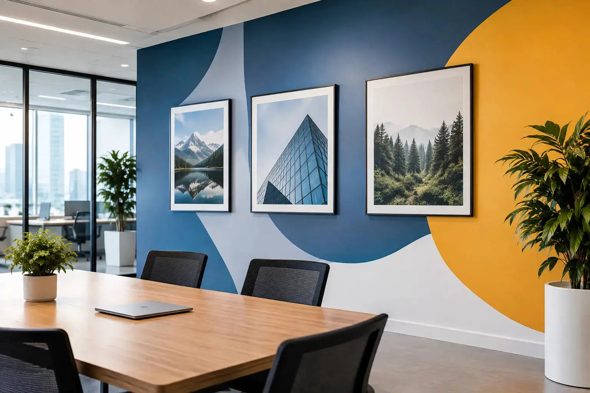
A blank office wall is not neutral space. It is an unclaimed opportunity to reinforce who your company is, what it values, and how it operates. To plan office wall branding effectively, start with the employee and visitor experience rather than a collection of logos. The strongest workplace branding feels intentional from reception to meeting rooms, without making every surface compete for attention.
For businesses moving into a new space, refreshing an existing office, or preparing a client-facing location, wall branding needs the same planning discipline as signage, packaging, and event displays. Material selection, visibility, durability, installation access, and brand consistency all affect the final result.
Start With the Purpose of Each Wall
Before selecting graphics or finishes, identify what each area needs to communicate. A reception wall has a different job from a collaboration space, corridor, pantry, or executive meeting room. Treating every wall as a place for the logo usually produces repetitive branding and weakens the impact of the spaces that matter most.
The reception area should establish confidence quickly. A dimensional logo, acrylic lettering, illuminated sign, or refined wall graphic can create a clear focal point for guests, clients, and candidates. The scale should suit the viewing distance and wall size. A small logo centered on a large feature wall often looks unfinished, while oversized graphics in a compact reception can feel crowded.
Meeting rooms benefit from branding that supports conversation without distracting from presentations or video calls. This may mean subtle logo placement, frosted glass film for privacy, company values, or project-specific visuals. For rooms regularly used in photographs, online meetings, and client presentations, consider the background visible behind speakers. A well-positioned brand element can improve visual consistency without turning the room into an advertisement.
Corridors and transition areas are useful for culture-led content. Timelines, mission statements, product milestones, team achievements, and visual stories give employees and visitors something meaningful to engage with as they move through the office. These spaces are also well suited to modular graphics that can be updated as the business grows.
Plan Office Wall Branding Around Real Work Zones
Office branding should reflect how people use the space, not simply where walls are available. Walk through the workplace at different times of day and note sightlines, traffic flow, lighting, furniture placement, and areas where people pause. A graphic hidden behind an open door, storage unit, or tall seating will not deliver the value expected from it.
Consider the experience in four key zones: arrival, collaboration, focus, and support. Arrival zones need immediate brand recognition and wayfinding. Collaboration zones can carry more expressive messaging, provided it does not interfere with screens or whiteboards. Focus zones generally need calm, low-contrast branding that supports concentration. Support zones, such as pantries, copy rooms, and staff areas, can carry culture messages, practical reminders, or lighter internal communication.
This approach also helps prioritize budget. If the project must be delivered in phases, start with the reception, primary meeting rooms, and high-traffic corridors. These areas usually provide the strongest impact for visitor perception and daily employee engagement. Secondary spaces can follow once the visual direction has been established.
Build a Clear Visual Hierarchy
A successful office wall is easy to read. It gives people one primary message, then supporting details if they choose to look closer. This matters especially for text-heavy walls, where an ambitious message can become difficult to absorb from a distance.
Use your logo, colors, typography, and photography consistently, but do not force every brand element into every design. A feature wall may need only a logo and a well-chosen finish. A culture wall may use headlines, icons, and employee-focused visuals. A wayfinding wall may prioritize large, legible directional text over decorative graphics.
Brand guidelines are a useful starting point, but they often need adaptation for large-format applications. Colors can look different on matte vinyl, painted surfaces, acrylic, fabric panels, or printed wallpaper. Fine details that work in a brochure may disappear at a distance. Before producing a large installation, review artwork at the intended scale and confirm that fonts, line weights, and image resolution are appropriate for the material.
Photography deserves particular care. Generic stock images can make an office feel disconnected from the people working there. When possible, use original workplace, product, team, or project photography that represents the business accurately. If stock imagery is necessary, choose visuals that match the brand’s market position and avoid images that will date quickly.
Select Materials for the Space and Expected Use
The best wall branding material depends on the wall finish, desired lifespan, maintenance requirements, and the level of flexibility needed. There is no single right choice for every office.
Vinyl wall graphics are a practical option for logos, campaigns, motivational statements, and large-format visual applications. They can be produced in a wide range of colors and finishes, making them suitable for both bold and understated designs. Their performance depends on correct surface preparation and choosing a film suited to the wall texture. Heavily textured, uneven, or recently painted surfaces may require testing before full production.
Acrylic signs and dimensional letters bring depth to reception walls and executive areas. They create a more permanent, premium presence and can be produced in different thicknesses, colors, and finishes. They work particularly well where the brand needs a crisp architectural look, though they require accurate measurements and professional installation planning.
Frosted glass film is useful for glass partitions, meeting rooms, and private offices. It improves privacy while preserving light flow and can carry logos, patterns, or subtle brand motifs. For offices with frequent layout changes, removable or replaceable graphic solutions may be more practical than permanent installations.
Wallpapers and large printed murals are effective for immersive visual storytelling, especially in corridors, breakout spaces, and customer experience areas. They require careful artwork setup, panel alignment, and surface preparation. A visually ambitious mural can be highly effective, but it should have a clear purpose. If the design does not support the culture, product story, or client experience, a simpler treatment may be the stronger choice.
Measure Before You Design
Designing from approximate dimensions is one of the most common causes of avoidable revision. Record the full wall width and height, then identify obstacles such as switches, sockets, fire equipment, access panels, cameras, screens, doors, and air-conditioning controls. Photograph each wall straight on as well as from typical approach angles.
Also assess the wall condition. Fresh paint may need curing time before adhesive graphics are installed. Dusty, uneven, damp, or damaged surfaces can affect adhesion and appearance. A professional site survey is especially valuable for multi-wall projects, glass partitions, oversized graphics, and dimensional signage because it confirms dimensions, material suitability, and installation logistics before production begins.
Lighting changes the result as much as the artwork does. Gloss finishes may reflect overhead lights or daylight from windows, while matte finishes are often easier to view under strong office lighting. If a wall is intended as a photo backdrop, check it through a phone camera as well as in person. What looks balanced to the eye can appear washed out or reflective on screen.
Coordinate Branding With the Fit-Out
Office wall branding is most efficient when planned alongside furniture, lighting, partitions, flooring, and AV equipment. Waiting until the fit-out is complete can limit options and create unnecessary work around finished surfaces. Early coordination allows branding elements to align with reception desks, seating areas, door frames, and display screens.
It also prevents practical conflicts. For example, a large wall graphic may need to stop short of a future TV mount, while illuminated signage may need electrical provision behind the intended location. Glass film layouts should account for door handles, manifestations, and safety markings. These details are small during planning but highly visible after installation.
For multi-site companies, create a repeatable specification for logo size, colors, materials, and placement rules. This does not mean every office must look identical. It means the core brand remains recognizable while each location can reflect its function, local team, or client audience.
Make Installation Part of the Plan
The final installation should be scheduled around office operations, access restrictions, and surface readiness. Confirm whether work can be completed during business hours, whether ladders or lifts are needed, and whether furniture must be moved. For active offices, phased installation can minimize disruption while keeping key areas operational.
Ask for production-ready artwork checks, material recommendations, and an installation plan before approving the project. Printava supports businesses with office branding materials, custom signage, wall graphics, and coordinated execution, helping teams move from concept to a finished workplace with fewer gaps between design and delivery.
A well-branded office does not need more graphics. It needs the right graphics in the right places, produced in materials that suit the environment and installed with care. Start with the walls people notice first, build a system that can grow with your business, and get a quote today when your plan is ready for production.