
A missing approval stamp, an unreadable date, or a vague “Received” mark can slow down an otherwise organized office. A well-planned custom rubber stamp design for office use turns repeat administrative actions into clear, consistent records. It helps finance teams track documents, reception teams route deliveries, HR teams control paperwork, and managers approve materials without rewriting the same information all day.
For businesses, the stamp is not just a desk accessory. It is a practical control point in a workflow. The right design must be readable at a glance, durable enough for regular use, and specific enough to prevent confusion later.
Start With the Workflow, Not the Artwork
The most useful office stamp starts with one question: what action should this mark confirm? Designing around appearance first often produces a stamp that looks branded but does not make work easier. Instead, identify the document, the user, and the next person who needs to understand it.
An accounts department may need “Paid,” “Processed,” “For Payment,” or “Approved” stamps with room for a date and signature. A reception desk may need “Received” with the company name and a date line. A warehouse or operations team may need “Checked By,” “Delivered,” or “Returned” markings that create an easy audit trail.
This approach also prevents overloading the stamp. If one stamp is trying to cover receiving, approval, filing, and customer communication, the result is usually crowded. Separate stamps are often more efficient when actions are distinct and frequently repeated.
Match the Stamp to the Person Using It
Consider who will use the stamp and how often. A finance coordinator processing dozens of invoices needs a quick, dependable marking system. A director who signs off on occasional documents may need a more formal approval stamp with a title or authorization line. A front-desk employee benefits from concise wording and a visible date field.
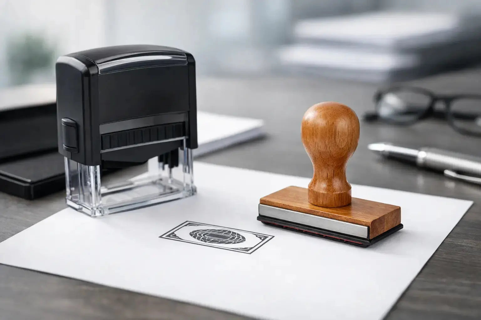
The user’s working environment matters too. For documents handled at counters or shared desks, self-inking stamps reduce setup time and keep the ink contained. For formal documents, certificates, or occasional use, a traditional stamp with a separate ink pad can offer more flexibility in ink color and application. The best option depends on volume, document type, and the degree of formality required.
Choose Text That Is Clear Under Pressure
Office stamps are often used when people are moving quickly. The wording should leave no room for interpretation. Short instructions and status terms perform better than long explanations.
For example, “Received” is stronger than “Document Received by Our Office.” “Approved” is clearer than “This Has Been Reviewed and Approved.” If a stamp needs additional context, use structured fields rather than a sentence. A simple format such as “RECEIVED / Date: ____ / By: ____” is easy to complete and easy to read later.
Use capitalization selectively. Full capitals work well for short status words such as PAID, COPY, CONFIDENTIAL, and APPROVED because they create immediate visibility. However, a complete stamp in all caps can feel dense, especially when it includes several lines of information. Combining a prominent status line with normal title case for secondary details usually gives a cleaner result.
Include Only the Information That Adds Value
Company name, department name, date, signature line, initials field, reference number, and contact details can all be useful, but they should not automatically appear on every stamp. Ask whether each element helps the receiving person take action or verify a record.
A “Received” stamp for internal invoices may need only the status, date, and initials. A dispatch stamp may need a company name, order reference field, and handler initials. A customer-facing stamp for documents leaving the office may include the company name and contact number, provided the layout remains readable.
Avoid tiny text to fit every detail into a small area. If the text cannot be read at normal document-handling distance, the design is working against the office process.
Select the Right Size and Layout
Size affects more than appearance. It determines where the stamp can be placed, how quickly it can be read, and whether handwritten fields remain usable. A compact round stamp can work well for simple verification marks or company details. A rectangular layout is usually better for approval, payment, receiving, and processing stamps because it provides natural space for lines and labels.
For basic status marking, a small to medium stamp keeps documents clean and fits easily in margins or designated boxes. For forms that require dates, initials, signatures, and multiple fields, a larger rectangular stamp provides better writing space. It is better to select a slightly larger format than compress key details into narrow lines.
Use visual hierarchy in the layout. The action word should be the first thing a reader sees. Supporting fields such as date, signature, or reference number should sit beneath or beside it with adequate blank space. Borders can help frame the content, but heavy decorative elements rarely improve office function.
Plan for Paper Type and Placement
A stamp that works on standard copy paper may behave differently on glossy forms, coated packaging slips, or textured documents. Ink selection should suit the paper stock used most often in the office. It is also worth checking where the mark will be placed. A stamp intended for invoice headers needs different proportions from one used in a dedicated approval section.
Before finalizing a design, review a sample of the actual documents your team uses. Look for available blank space, existing fields, and any information that must remain visible. This simple step prevents a common issue: ordering a useful stamp that covers invoice numbers, totals, or other essential details when applied.
Use Color With a Practical Purpose
Black and blue remain dependable choices for general office documentation because they are easy to read and reproduce clearly in scanned records. Red is highly visible and can be effective for urgent actions, payment status, corrections, or confidential handling. Green may suit approved or completed workflows where a clear visual distinction is needed.
Color should support a process, not create a decoration. If several departments use stamps, assigning colors by action can make document routing faster. For instance, blue can indicate received documents, green can indicate approval, and red can indicate pending correction. This system works best when staff understand it and the colors are applied consistently.
Keep in mind that some documents are copied or scanned in grayscale. A stamp should remain understandable from its wording and layout even when color differences are reduced.
Build Brand Consistency Without Crowding the Design
A custom office stamp can carry your company identity, particularly when it is used on official correspondence, quotations, delivery notes, and customer documents. A clean company name and a simple logo can reinforce professionalism. Still, the administrative purpose should lead the design.
If the logo includes fine lines, gradients, or very small lettering, it may not reproduce effectively at stamp size. A simplified version is often the better choice. Brand colors may be appropriate for selected stamps, but legibility, contrast, and document requirements should guide the final decision.
For companies managing multiple locations or departments, consistent stamp templates make a noticeable difference. Keep the same font style, border treatment, and field placement across related stamps, then change only the necessary department or workflow details. It creates a more controlled document system and makes replacement orders easier to manage.
Order as a System, Not as a One-Off Item
The strongest results come when office stamps are planned as a small operational set. Review common actions across reception, finance, HR, operations, and management. Then identify which labels are used repeatedly and which require a date, initials, or signature.
A practical office stamp set may include separate marks for received documents, invoice processing, payment confirmation, management approval, copies, confidential files, and dispatch checks. Not every business needs all of these. A startup may only require a few core stamps, while a growing company with multiple approval stages may benefit from a more defined set.
Before production, confirm the final wording, spelling, layout, ink color, stamp type, and quantity. It is also wise to nominate one person to approve standard wording so departments do not create slightly different versions of the same status stamp. That consistency saves time whenever records are reviewed, filed, scanned, or handed between teams.
Get the Details Right Before Production
A professional supplier can help translate an office requirement into a practical stamp format, but clear input makes the process faster. Share the intended wording, preferred size, logo file if needed, ink color, and whether users need date bands, signature lines, or other variable fields. If you have an existing document, providing a sample helps confirm fit and placement.
For Dubai businesses managing active procurement, finance, customer service, or operations desks, Printava can support custom office stamp requirements with a business-focused approach to layout, materials, and order coordination.
The best time to review your stamp system is before paperwork becomes difficult to track. Set clear actions, give each one a readable mark, and order designs that make everyday decisions easier to see. Get a quote today and put a more organized document flow on every desk.