A lobby says more than most sales decks. Before a client meets your team, before a candidate sits down for an interview, and before employees open their laptops, the space has already introduced your brand. That is why knowing how to brand office interiors matters. Done well, it turns walls, glass, reception areas, and meeting rooms into a clear, consistent business statement.
Office branding is not about covering every surface with logos. It is about shaping an environment that reflects who you are, what you do, and how you want people to feel when they walk in. For some companies, that means a polished corporate finish with clean signage and restrained graphics. For others, it means bold visual messaging, product storytelling, and a more energetic use of color.
What office branding should actually achieve
The best office branding has a job to do. It should strengthen brand recognition, support workplace experience, and make the space easier to navigate. If it only looks good in photos but creates visual clutter, it is not working hard enough.
A branded office should help clients feel confidence in your business. It should help employees feel connected to the company. It should also create consistency between your website, printed materials, packaging, uniforms, and physical environment. When those elements are aligned, your brand feels established rather than improvised.
This is where many projects go off track. Teams often focus on decorative ideas too early and skip the practical questions. Which zones matter most? Who uses them? What should each area communicate? A reception area needs a different approach than a staff breakout space or boardroom.
How to brand office interiors without overdoing it
A strong office branding project starts with restraint. If every wall carries a message, no message stands out. Good branding uses hierarchy. The entrance, reception desk backdrop, meeting room glass, wayfinding points, and key collaboration zones usually deliver the most value.
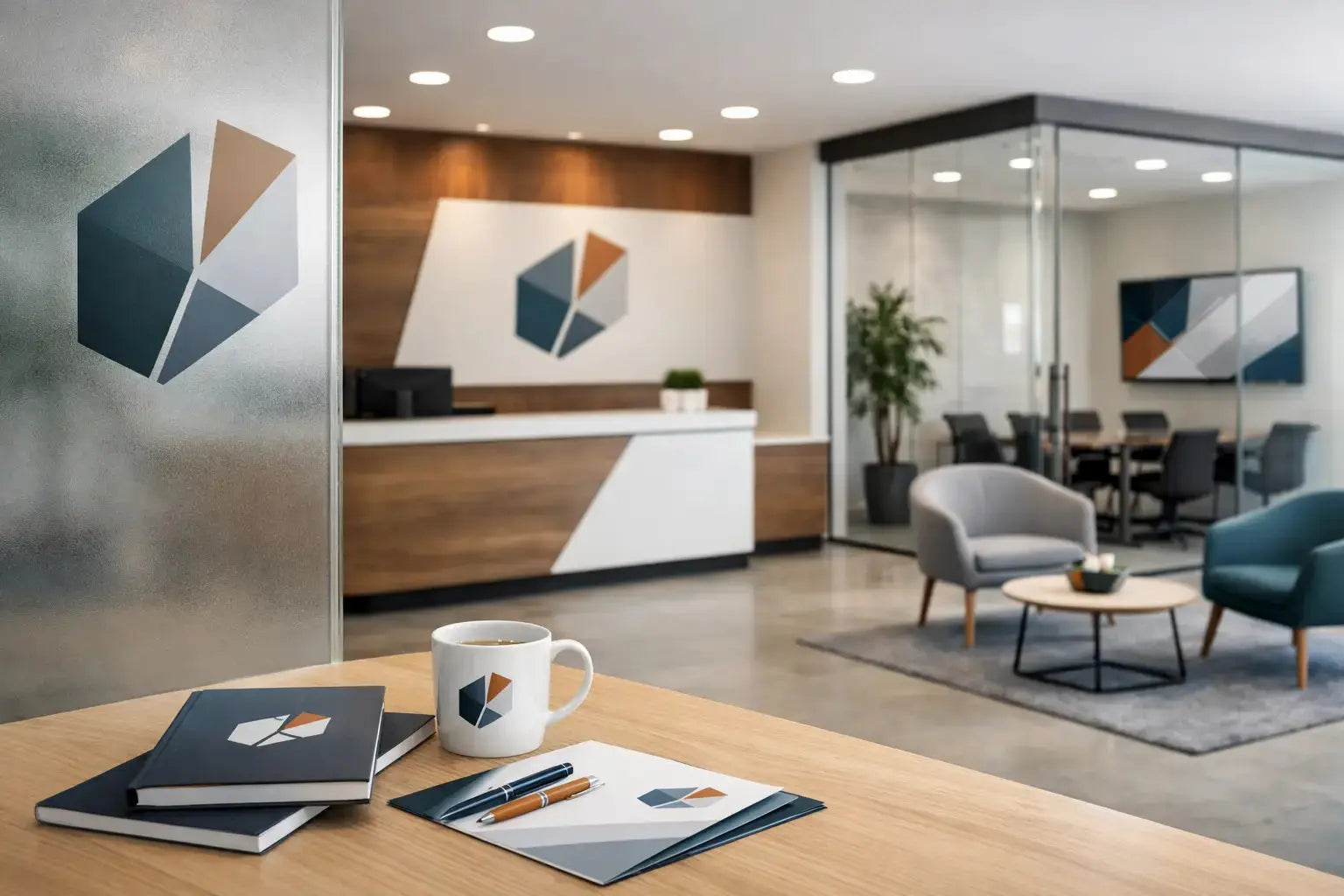
Start with the highest-visibility surfaces. Reception is the obvious first move because it creates the first impression. A clean logo application, dimensional lettering, acrylic signage, or a well-finished branded wall panel can establish credibility immediately. This area should feel intentional and premium, not crowded.
After that, look at circulation and shared spaces. Hallways, glass partitions, conference rooms, and waiting areas are useful for carrying brand colors, values, timelines, product visuals, or campaign messaging. The goal is to create continuity across the office rather than one branded corner and a lot of empty space.
The trade-off is simple. A minimal approach can feel elegant and corporate, but it may miss opportunities to communicate culture or service lines. A more graphic-heavy approach can energize the environment, but if it is not controlled, it can date quickly or distract from everyday work. The right balance depends on your business type, audience, and office layout.
The core elements of branded office interiors
When businesses ask how to brand office interiors effectively, the answer usually comes down to a mix of signage, graphics, materials, and placement.
Wall graphics are often the most visible component. These can include mission statements, brand patterns, service visuals, photography, timeline walls, or large-format printed designs that reinforce your identity. The best versions are specific to the business, not generic motivational artwork.
Glass branding is another high-value option, especially in offices with meeting rooms, executive cabins, or partitioned spaces. Frosted vinyl, cut decals, and printed graphics can add privacy while carrying the brand in a subtle, polished way. This is especially useful when you want the office to feel branded without making it visually heavy.
Reception signage remains one of the most important investments. Material choice matters here. Acrylic, brushed metal finishes, raised lettering, and illuminated signs each create a different impression. A finance firm may choose a cleaner and more understated finish, while a creative agency may want a stronger visual statement.
Wayfinding is often overlooked, but it matters more than many teams expect. Directional signs, room labels, floor identifiers, and departmental markers help visitors move confidently through the space. These details are practical, but they also reinforce professionalism and organization.
Match the design to the brand, not just the trend
A branded office should reflect the company, not the latest interior trend. Minimal monochrome graphics might work for one business and feel completely off-brand for another. The same applies to bright color blocking, oversized slogans, or heavily textured finishes.
The easiest way to stay aligned is to work from your existing brand system. Use your approved logo variations, typefaces, color palette, and tone of voice. If your customer-facing brand is structured and premium, your office should not feel casual and experimental. If your brand is energetic and product-led, the office should not feel generic and flat.
This is also where industry context matters. A law office, medical supplier, software company, retailer, and restaurant group will not brand their interiors the same way. Their visitors have different expectations. Their employees use space differently. Their compliance, privacy, and operational needs also vary.
Think in zones, not just surfaces
One of the most practical ways to plan office branding is by zone. This keeps decisions tied to purpose.
Reception should focus on first impressions and brand recognition. This is where your primary logo, key brand colors, and a premium material finish usually belong.
Meeting rooms should support professionalism and privacy. Glass manifestations, room naming systems, and subtle brand references usually work better here than loud visual messaging.
Work areas should support culture without creating distraction. This may include light-touch wall graphics, branded panels, or environmental visuals that reinforce values and team identity.
Breakout spaces can carry more personality. These areas are often suitable for culture walls, campaign visuals, or more relaxed messaging. They give you room to show the human side of the brand.
Corridors and transitional spaces are useful for storytelling. This is where company milestones, product journeys, service categories, or client-sector visuals can work well if they are designed cleanly.
Materials, durability, and maintenance matter
Branding decisions are not only visual. They are operational. A sign that looks excellent on day one but peels, fades, or becomes difficult to clean will quickly weaken the impression you are trying to build.
Material selection should suit the environment. High-touch areas need durable finishes. Glass applications should be installed cleanly and consistently. Wall graphics should be appropriate for the surface type and expected lifespan. If you are branding a leased office, removability may matter just as much as appearance.
This is one reason businesses often prefer working with a supplier that can advise on production and installation, not just design. The artwork may be approved quickly, but execution quality is what people see every day.
How to brand office interiors on a phased budget
Not every company needs a full office transformation at once. In many cases, a phased rollout is the smarter move. Start with the most visible and commercially important areas, then expand as the office evolves.
Phase one often includes reception branding, logo signage, meeting room glass, and essential wayfinding. That already changes how the office feels to visitors and staff.
Phase two can add culture walls, corridor graphics, breakout area visuals, and branded panels. Phase three may include seasonal campaign updates, product displays, or department-specific enhancements.
This approach helps control budget while keeping standards high. It also gives teams time to see how the first elements perform before committing to broader applications.
Common mistakes to avoid
The most common mistake is treating office branding as decoration instead of communication. When branding has no structure, it becomes visual noise.
Another issue is inconsistency. Colors that do not match brand guidelines, logo misuse, mixed material finishes, or uneven installation can make even a well-funded office look fragmented.
A third mistake is ignoring user experience. A branded office still needs to function as a workplace. If graphics reduce privacy, signage confuses visitors, or visual density distracts teams, the project is not helping the business.
For companies managing office branding in Dubai or across the UAE, speed and coordination also matter. Site access, approvals, measurements, material selection, and installation planning all affect the final result. Working with an experienced production partner helps reduce delays and keeps the output consistent across categories.
A well-branded office does not need to shout. It needs to feel clear, credible, and considered. If your space reflects your standards as well as your services do, people notice - and they remember it. If you are planning a new fit-out or upgrading an existing workspace, get a quote today and start with the areas that carry the most brand weight.