
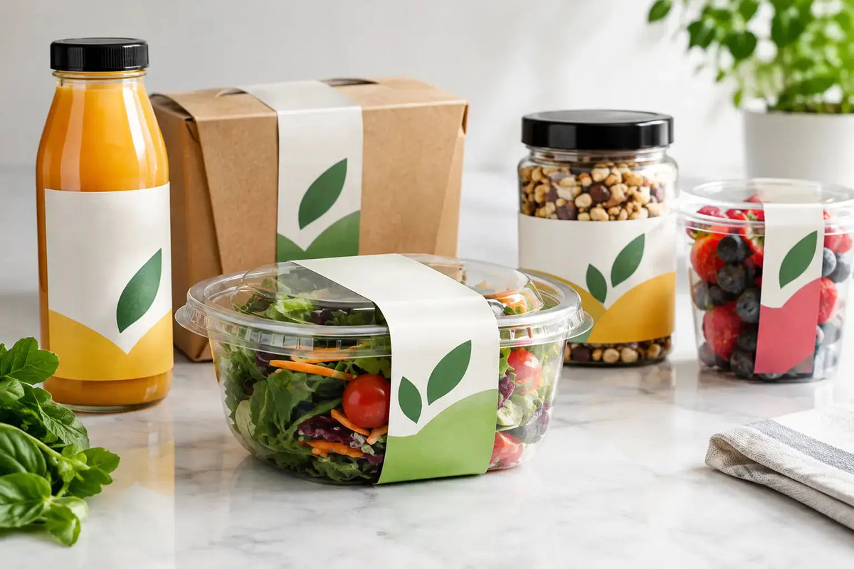
A shopper may spend only a few seconds comparing products on a shelf, in a chiller, or on a delivery counter. In that short window, food labels need to do several jobs at once: identify the product, communicate essential information, reinforce brand quality, and remain readable through handling, refrigeration, and transport. For restaurants, food producers, retailers, and growing packaged-food brands, the label is not a finishing detail. It is part of the product experience.
The right label specification helps your packaging look consistent across every unit while supporting practical operating needs. The wrong one can peel in cold storage, smudge after condensation, clash with the container shape, or leave key details difficult to read. A considered approach to label design, material, adhesive, and finish protects both presentation and efficiency.
What Effective Food Labels Need to Do
A good food label starts with a clear hierarchy. Your product name and brand should be easy to spot first. The next layer should help the customer make a decision: flavor, variant, key ingredient, dietary positioning, weight, preparation guidance, or storage instruction. Required information must remain legible, but it should not overwhelm the package.
This balance matters especially for products with limited label space. A small sauce jar, coffee pouch, dessert cup, or takeaway container cannot carry every message at the same visual weight. Prioritize the information that shoppers and operators need most, then structure the remaining copy with disciplined typography and spacing.
For packaged products sold in the UAE, labeling requirements can vary by product category, sales channel, and destination. Ingredient declarations, allergen statements, dates, country-of-origin details, storage directions, barcode requirements, and language presentation may all need consideration. Treat regulatory content as a project requirement from the first artwork review, not an item to squeeze in before production. Your compliance or product team should confirm the applicable rules before the print file is approved.
Choose the Label Material for the Real Environment
Paper labels can be an excellent choice for dry goods, bakery boxes, tea packaging, coffee bags, gift hampers, and products that benefit from a natural or premium textured appearance. They offer strong print clarity and work well where the surface stays dry. However, standard paper may not be the right fit for products exposed to moisture, oil, freezer storage, or frequent wiping.
Synthetic label stocks are generally better suited to demanding conditions. They can provide improved resistance to water, refrigeration, condensation, and handling. They are often a practical option for bottled beverages, chilled ready meals, dairy products, frozen items, sauces, and personal-care products that sit alongside food ranges.
The container itself also affects the decision. Glass, plastic, metal, coated cardboard, kraft paper, flexible pouches, and textured packaging surfaces each behave differently. A label that performs well on a smooth plastic bottle may not apply the same way to a curved jar or low-energy plastic container. Adhesive selection matters as much as the face material, particularly where labels are applied to cold surfaces or used in chilled display environments.
Before committing to a full run, test the label on the actual packaging. Check application, edge lift, scuffing, readability, and appearance after the product has been stored and handled as intended. This small step can prevent unnecessary rework later.
Consider Storage, Handling, and Shelf Life
Ask direct operational questions before choosing a stock. Will the product be refrigerated, frozen, heated, or exposed to humidity? Is the package likely to collect condensation? Will staff apply labels by hand, or will they be applied through a labeling process? Does the product travel in delivery bags, cartons, or refrigerated transport?
A short campaign run for a dry promotional snack may need a different solution than a retail product expected to stay on shelf for months. There is no single best material for every food application. The right option depends on the conditions the label will face after it leaves production.
Design Food Labels for Fast Decisions
The front label should work from a normal viewing distance. Customers should not need to pick up every package to understand what it is. Use a product name that is prominent, a color system that distinguishes variants, and imagery only when it adds real clarity or appetite appeal.
Consistency is especially valuable when you sell multiple flavors or product sizes. Keep the logo placement, font family, key information zones, and overall layout stable. Then use controlled changes in color, flavor cues, or secondary graphics to differentiate the range. This makes products easier to recognize and improves shelf impact without forcing customers to relearn the pack each time.
Legibility should guide every design choice. Fine type, low-contrast text, crowded ingredients panels, and overly reflective finishes may look attractive on screen but become difficult to use in real retail conditions. A clear label builds confidence. It also reduces questions for staff and helps customers find the information they need quickly.
For bilingual or multilingual labels, allow sufficient space from the beginning. Trying to add a second language after the main design is complete usually creates compressed text and inconsistent spacing. Build a proper grid so every language remains readable and the design still looks intentional.
Finishes That Support Your Brand Positioning
Print finish changes how customers perceive the package before they even open it. A matte finish can give artisan foods, specialty coffee, premium sauces, and wellness-focused products a refined, understated appearance. Gloss can make colors feel more vivid and is often suited to bright beverages, confectionery, and high-energy retail ranges.
Lamination can add a useful protective layer where labels face moisture and frequent contact. Specialty details such as metallic effects, spot gloss, or textured stocks can create a premium result, but they should support the product positioning rather than distract from essential information. They also add complexity, so they are best chosen with a clear commercial purpose.
For many businesses, a well-designed full-color label on the correct durable material delivers the strongest return. The goal is not to use every available effect. The goal is to create a label that looks right for the product, works reliably, and stays consistent across future orders.
Plan the Print Specification Before Ordering
A print-ready food label order requires more than a logo and a rough size. Finalize the container dimensions, label shape, application area, quantity, artwork, material preference, finish, and whether labels need to be supplied on rolls or sheets. Roll labels are often the practical choice for higher-volume application and organized dispensing, while sheets can suit certain short-run or manual labeling requirements.
Shape also affects cost and usability. Standard rectangles, squares, circles, and ovals are efficient formats for many products. Custom die-cut shapes can add distinction, but they require a precise specification and are most valuable when the silhouette strengthens brand recognition or fits an unusual package area.
Include adequate bleed around the artwork and keep critical text away from trim lines. Barcodes need appropriate size, contrast, and quiet space to scan reliably. If variable details such as batch numbers, production dates, or expiry dates are added after printing, leave a dedicated clear area that works with your chosen marking process.
A professional proof review should check more than spelling. Confirm the final size against the physical pack, verify color expectations, examine the placement of mandatory content, and review every flavor or variant. Packaging errors become expensive when repeated across a full product run.
A Practical Route from Artwork to Application
The most efficient projects begin with a short brief. Share the product type, packaging sample or dimensions, intended use conditions, required quantity, and target delivery date. This allows the print supplier to recommend a suitable label material and format rather than quoting a generic option that may not match the job.
Printava supports businesses that need branded labels aligned with their packaging, promotional, and operational requirements. Whether you are preparing a new retail range, updating restaurant packaging, or organizing labels for an event activation, clear specifications lead to faster approvals and a more dependable finished result.
Keep approved artwork files, specifications, and reorder quantities organized after the first run. When the next order is needed, a documented standard helps maintain color, size, and material consistency across locations and campaigns. It also makes product expansion simpler when a new flavor, seasonal format, or limited edition is introduced.
Your packaging has already done the work of getting the product into customers' hands. Give it a label that communicates clearly, performs in its environment, and makes the next purchase feel like an easy decision. Request a quote with your packaging details and start printing with a specification built for the way your product is actually sold.