
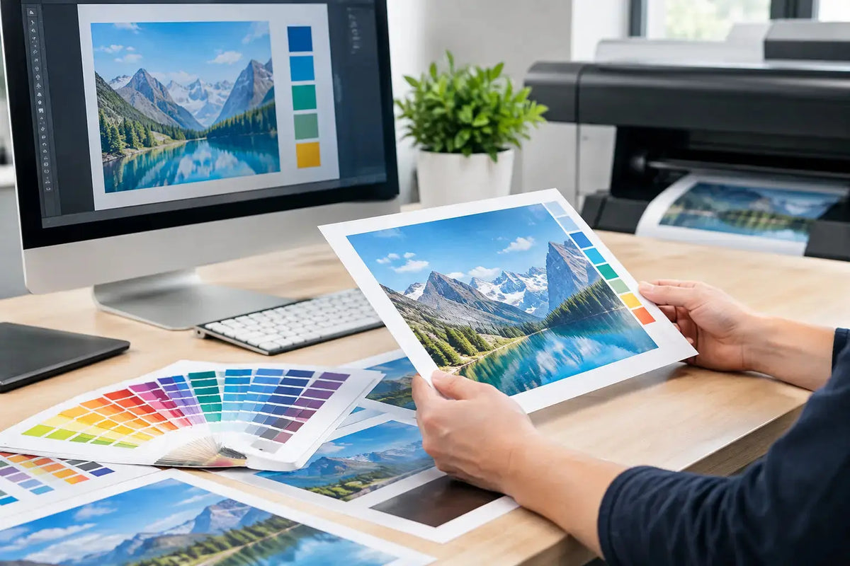
A business card with a hairline border, a product box with an exact logo color, or a large exhibition graphic can all look right on screen and still need production adjustments. To prepare artwork for commercial printing, the file must account for trim, material, ink behavior, finishing, and the physical scale of the final product. Getting those details right before production protects your brand consistency and helps keep projects moving on schedule.
Start With the Final Product Specification
Artwork should be built around the finished product, not around a generic document size. Confirm the final dimensions, orientation, stock or material, print method, finishing, and quantity before your designer begins. A folded brochure, for example, needs a different setup from a flat flyer. A sticker with a custom die-cut shape needs a different approach from a rectangular label.
This matters because folding, binding, lamination, die-cutting, and large-format installation can all affect where important artwork should sit. Packaging also requires special attention to panels, folds, glue areas, and opening direction. If the product has a supplied template or dieline, use that exact file and keep it on its own locked layer.
For business materials, ask practical questions early: Will this be handed out, mounted on a wall, wrapped around a product, or viewed from several meters away? The answers influence text size, image selection, substrate, and finishing choices. A small QR code that works on a brochure may be difficult to scan on a textured promotional item or from a distance on signage.
Set Size, Bleed, and Safe Areas Correctly
Commercial presses and finishing equipment work with tolerances. Paper and other substrates are trimmed after printing, so artwork that extends to the edge must include bleed. Bleed is the extra image or background area beyond the final cut line. It prevents a thin unprinted edge if trimming shifts slightly.
The exact bleed requirement depends on the product and production method. For many printed pieces, 0.125 inch is common, while large-format graphics, packaging, and custom-cut items may require a different allowance. Do not assume one setup applies to every job. Confirm the specification before exporting the file.
Keep essential content inside the safe area. Names, phone numbers, logos, legal text, and key visual details should sit comfortably away from the trim line, folds, holes, and finished edges. This is especially important for business cards, menus, labels, tent cards, and booklets. A background can run through the bleed, but a logo placed too close to the edge can appear uneven after trimming.
Borders need careful judgment. A border very close to the edge may look unbalanced even when the cut is within tolerance. If an edge-to-edge border is central to the design, allow more visual space or consider whether the layout can achieve the same effect without relying on a narrow frame.
Use Print-Ready Color Settings
Screens display color with RGB light, while most commercial print uses CMYK inks or a defined spot-color process. Files supplied in RGB may be converted during production, but that conversion can change bright blues, greens, oranges, and fluorescent-looking shades. Convert and review color intentionally rather than leaving a critical brand color to an automatic workflow.
For standard process work, build artwork in the CMYK profile requested for the job. For brand colors that must match a specified standard, discuss spot colors or approved color references at the quoting stage. This is particularly valuable for packaging, corporate stationery, retail graphics, uniforms, and repeat campaigns where consistency matters across multiple materials.
Color is also affected by the surface. Uncoated paper absorbs ink differently from coated stock. Vinyl, fabric, kraft packaging, acrylic, and textured materials each produce a different visual result. A proof on one material is not always a perfect predictor of another. When color precision is a priority, request a proof or sample approach appropriate to the project.
Avoid using registration color for small black text or fine lines. Registration color is intended for printer marks and can place ink on multiple plates, which may affect sharpness on detailed elements. For standard black text, use a single black channel according to the printer's file guidance.
Prepare Images, Logos, and Graphics at the Right Quality
Image resolution should match the final printed size. As a general rule, standard printed materials need images at about 300 ppi at their placed size. Enlarging a small web image inside a design program does not add detail. It only makes softness or pixelation more visible.
Large-format output is different because it is generally viewed from farther away. The required resolution may be lower depending on the final size, viewing distance, material, and installation location. A wall graphic viewed up close has different needs from a banner displayed across an event hall. Send the intended dimensions and use case with the artwork so the production team can advise accurately.
Use vector files for logos, icons, typography, and line art whenever possible. Vector graphics remain sharp when scaled, making them ideal for signage, decals, branded merchandise layouts, and exhibition materials. Raster images are appropriate for photographs, but they should be high-resolution originals rather than screenshots, social media downloads, or compressed files.
Check all placed images, not only the main hero image. Small background photos, patterns, and embedded icons can be overlooked, yet one low-resolution asset can affect the final result. Review image links before export to make sure nothing is missing or replaced by a low-quality preview.
Protect Fonts, Lines, and Fine Details
Typography is one of the most common causes of preventable artwork issues. Package fonts with the working file when requested, or convert approved final text to outlines where suitable. Outlining prevents font substitution, but it also makes text harder to edit, so retain an editable master file separately.
Before finalizing, proofread every contact detail, date, location, product code, QR code, and call to action. A print-ready PDF confirms file structure, but it does not confirm that the wording is correct. For time-sensitive event materials, this review should include the event team as well as the designer.
Use line weights that suit the final material and print process. Very thin rules, reversed-out type, and tiny details may not reproduce consistently on every substrate. This is not a reason to avoid refined design. It is a reason to align the design with the production method. A fine line that works on coated paper may need adjustment for fabric, textured stock, or large-format output.
Export a File Built for Production
A high-resolution PDF is often the preferred final format because it can preserve vectors, fonts, images, and page geometry in one file. PDF/X settings are commonly useful when specified, as they are designed for print workflows. However, the right export preset depends on the product, so follow the requested file specification rather than using a one-size-fits-all setting.
Include crop marks only when requested. If the document already contains the correct bleed and page size, unnecessary marks can complicate certain production workflows. Do not add manual trim lines, bleed shapes, or duplicate dielines unless they are part of the approved template.
For custom shapes, labels, packaging, and display items, name production layers clearly. A typical setup may separate print artwork, cut contour, white ink, varnish, or foil guidance. The exact naming convention varies by process, so confirm it before submission. Keeping these instructions organized reduces back-and-forth and helps the production team interpret the file correctly.
Run a Final Preflight Before Sending Artwork
Before release, inspect the PDF at 100% and at the final intended scale. Check that pages are in the right order, backgrounds extend through bleed, and all important elements stay inside the safe area. Review overprint settings, transparency effects, and black values where relevant.
A final preflight should also confirm these four points:
- The file dimensions match the approved product size and any required bleed.
- Images are suitable for their final print size, with no missing links or unexpected substitutions.
- Brand colors, logo versions, and spelling have been approved by the right stakeholders.
- Finishing instructions, quantities, and delivery requirements match the purchase request.
Share Context With Your Print Partner
A file is easier to produce accurately when it arrives with clear job information. Include the product name, final size, quantity, material preference, finishing requirements, deadline, and intended use. If the piece must coordinate with existing packaging, office graphics, uniforms, or event displays, provide approved brand references early.
For UAE businesses managing fast-moving campaigns, events, retail launches, or corporate gifting, this planning step can prevent avoidable revisions. Printava can review supplied artwork and production requirements before work begins, helping teams choose a setup that fits the product and the intended result.
The strongest print files are not simply attractive designs. They are designs prepared for the exact way they will be produced, finished, handled, and seen. Send your specifications with the artwork, ask questions before approval, and give your printed materials the clear, professional finish your brand deserves.