
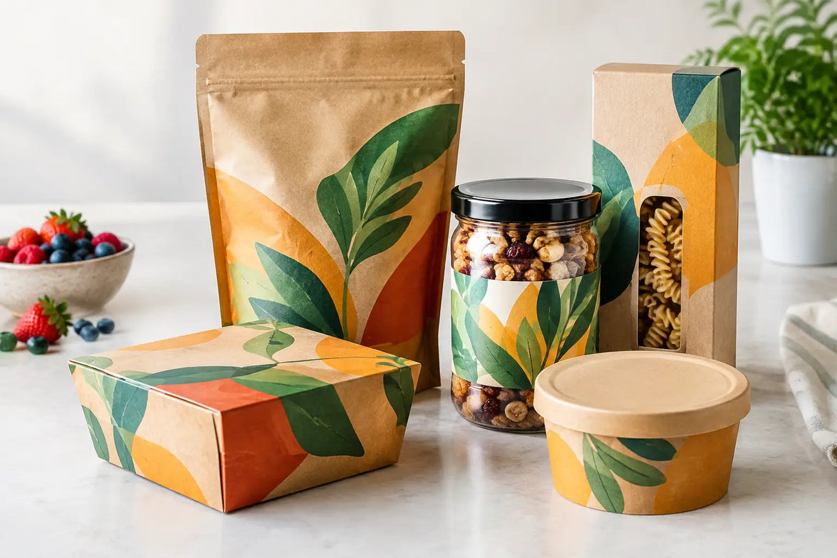
A customer may give a food product only a few seconds of attention before choosing a competing item. Designing food packaging artwork is therefore not simply about making a pack look attractive. It is about helping shoppers identify the product, understand its value, and trust what they are buying - while ensuring every printed panel is accurate, compliant, and ready for production.
For restaurants, food retailers, private-label brands, and growing FMCG businesses, effective artwork brings brand consistency to every shelf, delivery order, and retail display. The strongest designs balance commercial impact with practical print requirements from the start.
Start With the Packaging Format, Not the Screen
Artwork should be built around the actual packaging structure. A design that looks balanced on a flat presentation may lose key information around a curved bottle, folding carton edge, pouch seal, or lid overlap. Before design begins, confirm the final pack type, dimensions, material, printing method, and closure areas.
A supplied dieline is the working blueprint. It identifies trim lines, folds, glue areas, safe zones, perforations, and bleed. Use the approved dieline at its original scale, and do not move critical text or logos too close to edges. For pouches and wrappers, allow for the visual effect of gussets, crimp seals, and product fill level. For labels, consider the container shape and whether the label will sit straight once applied.
This stage is also where operational choices affect design freedom. A short-run digital label may suit multiple flavors or seasonal promotions. A larger, repeat order may justify a different print process or packaging construction. The right option depends on order volume, required finish, product handling, and how often the artwork will change.
Designing Food Packaging Artwork Around Buyer Decisions
The front of pack has one job: communicate the product quickly. Shoppers should not have to search for the brand, product name, flavor, format, or primary benefit. Give each element a clear order of importance rather than making every message compete at the same size.
In many categories, the brand name leads, followed by the product type and flavor. In others, such as a specialty snack or functional beverage, a distinctive product promise may need more visual weight. The correct hierarchy depends on how familiar the brand is, how crowded the category is, and what makes the item worth choosing.
Use color with purpose. A color system can help customers recognize variants from a distance, such as red for spicy, green for herb-based, or purple for berry. However, flavor color should support the brand rather than replace it. If every SKU uses a completely different visual style, the range can lose shelf recognition.
Photography, illustration, and ingredient imagery should also reflect the actual product positioning. Premium products often benefit from restrained layouts, tactile finishes, and carefully controlled imagery. Value-focused products may require stronger product visibility and larger pack claims. Neither approach is automatically better. The design needs to match the customer, price point, and retail environment.
Make Essential Information Easy to Find
The back and side panels carry the information that supports a purchase decision and helps the product move through retail channels. Nutrition details, ingredients, allergen statements, storage instructions, preparation guidance, net weight, batch information, barcodes, and manufacturer details need dedicated space from the beginning.
Do not treat these items as content to be squeezed in after the visual design is approved. Small text, low contrast, busy backgrounds, and insufficient clear space can create costly revisions. Leave room for variable data if expiry dates, lot codes, or production details will be added during packing.
Requirements differ by product category and selling market. Confirm applicable labeling rules with the relevant regulatory and food compliance teams before releasing files to print. A packaging printer can support production-ready setup, but legal claims, nutrition statements, and required declarations should be approved by the brand owner or qualified advisor.
Choose Materials and Finishes That Support the Product
Packaging artwork is experienced through the material, not just viewed as a digital file. A matte label can make a specialty coffee or gourmet sauce feel considered and premium. Gloss may increase color vibrancy and suit bright beverages, confectionery, or promotional packs. Foil accents, embossing, spot UV, and textured stocks can add distinction, but they should reinforce the product story rather than become decoration without a purpose.
Material choice also needs to work under real conditions. Refrigerated products may face moisture and condensation. Takeaway packaging may encounter heat, oil, and frequent handling. Frozen items require labels and adhesives suited to low temperatures. A finish that looks excellent on an unfilled sample may perform differently in transport, storage, or retail display.
Ask practical questions before approving a finish: Will the pack be stacked? Will labels be applied by hand or machine? Does it need to resist scuffing? Will it be photographed for online menus or delivery apps? These details influence substrate, adhesive, lamination, and coating choices.
Build Artwork for Accurate Printing
Good packaging files reduce delays at the production stage. Use high-resolution images at the final print size, keep brand logos in suitable vector formats, and prepare colors according to the selected print process. A bright screen color may not reproduce exactly on a natural paper stock, metallic surface, or transparent label, so physical proofs are valuable when color consistency is critical.
Bleed is essential for any background color or image that reaches the edge of a printed piece. Extend it beyond the trim line to avoid unwanted white edges after cutting. Keep text, barcodes, and fine lines within the safe area. For barcodes, preserve adequate contrast and quiet zones so they can scan reliably at checkout.
Black text requires particular attention. Small body copy should generally use a simple black build to stay crisp. Large black backgrounds may use a richer color build when appropriate for the printing method, but this should be set with the printer's guidance. Fine reversed text, very thin lines, and small metallic details can be difficult to reproduce consistently, especially on textured materials.
A structured prepress review should check the final dimensions, dieline version, spelling, product information, image resolution, color settings, bleed, safe zones, and barcode placement. It is faster to correct these points before plates, labels, cartons, or flexible packaging enter production.
Design a System for Product Ranges and Campaigns
Single-product packaging can rely on a strong one-off concept. A product range needs a system. Establish consistent positions for the logo, product name, legal panel, nutrition area, and barcode, then create controlled variation through color, flavor imagery, icons, or pattern.
This approach helps marketing teams launch new SKUs without rebuilding the entire design every time. It also makes procurement simpler because packaging specifications, approved materials, and print standards are already defined. For restaurants and food brands with changing menus, a modular label system can keep short-run updates aligned with the master brand.
Campaign packs deserve the same discipline. A limited-edition sleeve, promotional sticker, or event-ready takeaway box should still look unmistakably part of the brand. Add the campaign message without covering core product information or weakening recognition on shelf.
Approve Proofs With Real-World Use in Mind
A digital PDF is useful, but it cannot reveal everything. Review a physical proof or production sample when possible, particularly for new packaging formats, color-sensitive brand palettes, specialty finishes, or high-volume orders. Place the sample near comparable products, view it under retail lighting, and read it at normal handling distance.
Check whether the product name can be understood quickly, whether small copy remains readable, and whether the chosen material supports the intended quality level. If packaging will be used for delivery, test it with actual food containers, bags, and labels. The aim is not only an attractive proof but a pack that performs reliably from packing station to customer.
For businesses that need coordinated labels, cartons, stickers, sleeves, and promotional materials, Printava can help align artwork requirements with the selected print format before production starts. That early coordination protects brand consistency and avoids avoidable setup changes.
The most useful next step is simple: bring the product specification, final pack dimensions, brand assets, and required content together before creative approval. When design and production decisions are made as one process, your packaging has a better chance of looking right, printing accurately, and earning its place on the shelf.